Making a website for my friend's restaurant with Gatsby - making layout


Goal
This time I am going to make gatsby's layout component and make header/main/footer component.
To check my code, please check this commit to follow my tutorial.
If there is any question following my tutorial, please contact me or leave comments.
Material UI
Material UI installation guide
I chose Material UI for my project. Because even though I can handle CSS, I am not super-specialized in it. To use Material-UI in Gatsby project, you have to install material-ui and material-ui plugin.
npm install @material-ui/core
npm install gatsby-plugin-material-ui
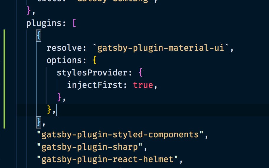
After installing the package and the plugin, you have to fix gatsby-config.js.
Update your gatsby-config.js like below.
{
      resolve: `gatsby-plugin-material-ui`,
      options: {
        stylesProvider: {
          injectFirst: true,
        },
      },
},
Layout
To make Layout you need layout component. visit official docs
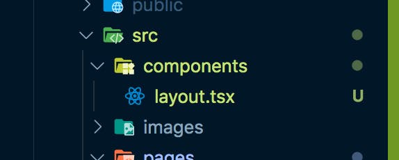
Make a folder named components. And make layout.js or layout.tsx.
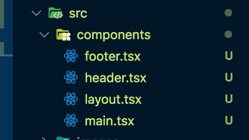
I'm going to make a layout using Header, Main, Footer components.
This is how my layout.tsx looks like.
import React, { FC } from "react";
import Header from "./header";
import Main from "./main";
import Footer from "./footer";

const Layout: FC<any> = ({ children }) => {
  return (
    <>
      <Header />
      <Main>{children}</Main>
      <Footer />
    </>
  );
};

export default Layout;
With this layout component, you just have to make a component that goes inside Main part!
import * as React from "react";
import Layout from "../components/layout";

const IndexPage = () => {
  return (
    <Layout>
      <div>Index Page</div>
    </Layout>
  );
};

export default IndexPage;
Starting now, all I have to care about in building pages is what goes inside Main
I made Header/Main/Footer component all under the components folder.
Check this commit to see what I did.
Applying Material UI and Making Header with React-responsive
Last thing I am going to do in this tutorial is to make a header, which is responsive to screen size.
To do this, I installed React-responsive
npm i react-responsive
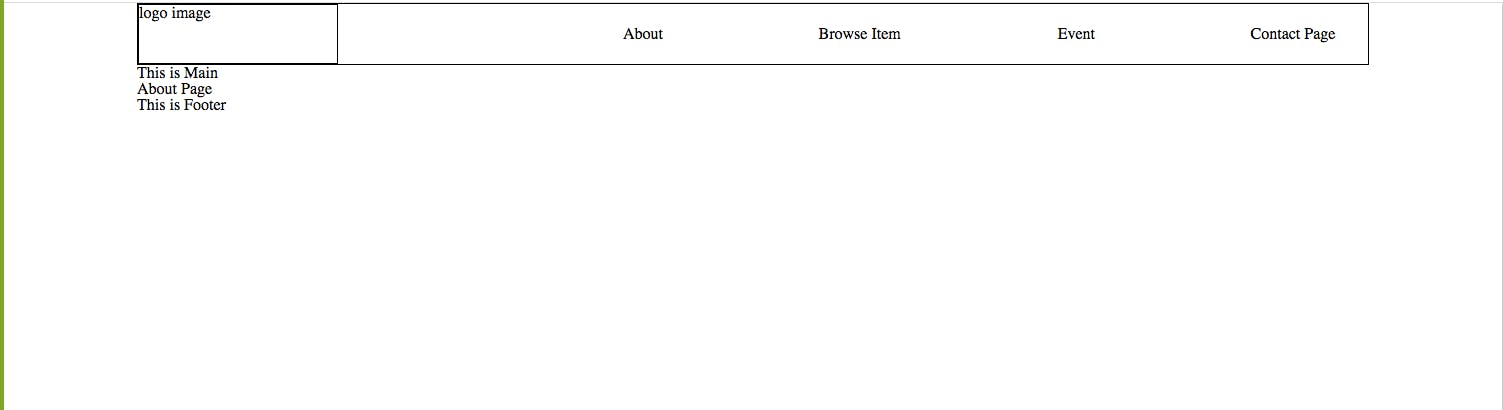
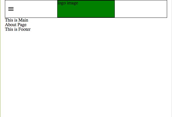
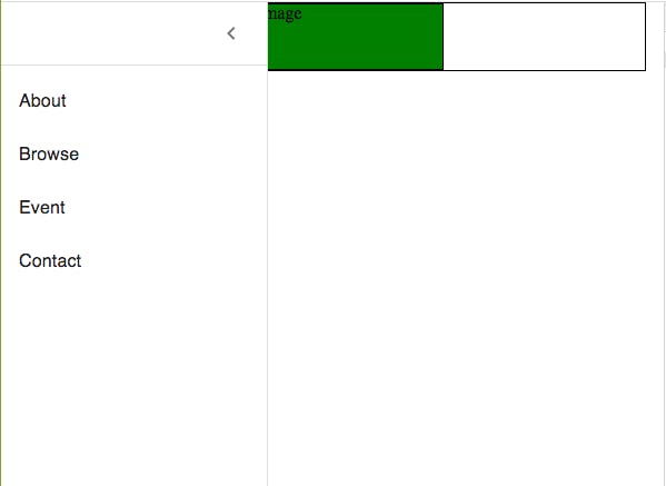
These are the screenshots of how my header looks like now.
- full size:
- small size:
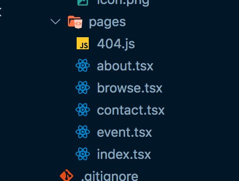
First, I made four pages. This is easy job. You have to make components under the pages folder with file names that will become page routes.
It is hard to explain every code I've written, so I am goint to show you how I applied react-responsive.
This is how my menu-bar.tsx looks like.
import React, { useState, FC } from "react";
import { useMediaQuery } from "react-responsive";

import SmallerMenu from "./smaller-menu";
import BiggerMenu from "./bigger-menu";

const MenuBar = () => {
  const isBigScreen = useMediaQuery({ query: "(min-width: 1100px)" });

  return <>{isBigScreen ? <BiggerMenu /> : <SmallerMenu />}</>;
};

export default MenuBar;
In this component, I used useMediaQuery from react-responsive. If it is bigger than 1100px, it shows BiggerMenu. And when it is smaller than that, it shows SmallerMenu.
I made BiggerMenu component with custom css. But to make SmallerMenu, I used Material-UI.
In the picture above, I used Drawer component
This is how my smaller-menu looks like.
import { Link } from "gatsby";
import React, { useState, FC } from "react";
import Logo from "./logo";
import styled from "styled-components";
import { makeStyles, useTheme } from "@material-ui/core/styles";
import MenuIcon from "@material-ui/icons/Menu";
import Drawer from "@material-ui/core/Drawer";
import List from "@material-ui/core/List";
import Divider from "@material-ui/core/Divider";
import IconButton from "@material-ui/core/IconButton";
import ChevronLeftIcon from "@material-ui/icons/ChevronLeft";
import ChevronRightIcon from "@material-ui/icons/ChevronRight";
import ListItem from "@material-ui/core/ListItem";
import ListItemText from "@material-ui/core/ListItemText";

const drawerWidth = 240;

const useStyles = makeStyles((theme) => ({
  root: {
    display: "flex",
  },
  appBar: {
    transition: theme.transitions.create(["margin", "width"], {
      easing: theme.transitions.easing.sharp,
      duration: theme.transitions.duration.leavingScreen,
    }),
  },
  appBarShift: {
    width: `calc(100% - ${drawerWidth}px)`,
    marginLeft: drawerWidth,
    transition: theme.transitions.create(["margin", "width"], {
      easing: theme.transitions.easing.easeOut,
      duration: theme.transitions.duration.enteringScreen,
    }),
  },
  menuButton: {
    marginRight: theme.spacing(2),
  },
  hide: {
    display: "none",
  },
  drawer: {
    width: drawerWidth,
    flexShrink: 0,
  },
  drawerPaper: {
    width: drawerWidth,
  },
  drawerHeader: {
    display: "flex",
    alignItems: "center",
    padding: theme.spacing(0, 1),
    // necessary for content to be below app bar
    ...theme.mixins.toolbar,
    justifyContent: "flex-end",
  },
  content: {
    flexGrow: 1,
    padding: theme.spacing(3),
    transition: theme.transitions.create("margin", {
      easing: theme.transitions.easing.sharp,
      duration: theme.transitions.duration.leavingScreen,
    }),
    marginLeft: -drawerWidth,
  },
  contentShift: {
    transition: theme.transitions.create("margin", {
      easing: theme.transitions.easing.easeOut,
      duration: theme.transitions.duration.enteringScreen,
    }),
    marginLeft: 0,
  },
}));

const HamburgerMenu = styled.div`
  height: 60px;
  width: 40px;
  display: flex;
  align-items: center;
  justify-content: center;
  cursor: pointer;
`;

const SmallerMenu: FC = () => {
  const classes = useStyles();
  const theme = useTheme();
  const [open, setOpen] = React.useState(false);

  const handleDrawerOpen = () => {
    setOpen(!open);
  };

  const handleDrawerClose = () => {
    setOpen(false);
  };

  return (
    <>
      <HamburgerMenu>
        <MenuIcon
          onClick={() => {
            handleDrawerOpen();
          }}
        />
      </HamburgerMenu>
      <Logo />
      <Drawer
        className={classes.drawer}
        variant="persistent"
        anchor="left"
        open={open}
        classes={{
          paper: classes.drawerPaper,
        }}
      >
        <div className={classes.drawerHeader}>
          <IconButton onClick={handleDrawerClose}>
            {theme.direction === "ltr" ? (
              <ChevronLeftIcon />
            ) : (
              <ChevronRightIcon />
            )}
          </IconButton>
        </div>
        <Divider />
        <List>
          {[
            ["About", "/about/"],
            ["Browse", "/browse/"],
            ["Event", "/event/"],
            ["Contact", "/contact/"],
          ].map(([text, url], index) => (
            <ListItem button key={text}>
              {/* <ListItemIcon>
                {index % 2 === 0 ? <InboxIcon /> : <MailIcon />}
              </ListItemIcon> */}
              <Link
                to={url}
                style={{
                  color: `inherit`,
                  textDecoration: `none`,
                }}
              >
                <ListItemText primary={text} />
              </Link>
            </ListItem>
          ))}
        </List>
      </Drawer>
    </>
  );
};

export default SmallerMenu;
Finishing
I had some struggle making a responsive header just with media query. But with react-responsive, it got so much easier. And also using Drawer from Material UI saved my time A LOT!
If there is anyone who has a hard time figuring out how to apply Material-UI or react-responsive, I hope this tutorial helps!
Again, please leave me comments if you have any questions!